YouTube Shorts — fixing a feed that started feeling like everyone else's.
A NextLeap Fellowship case. The brief: improve Shorts feed quality. The temptation: redesign the UI. The actual answer: it was never about the UI. It was about the supply of original content.
"Improve feed quality on YouTube Shorts."
Five words. No constraints. No metric. Just an open-ended product question with a sneaky catch — Shorts is YouTube's existential response to TikTok and Instagram Reels, and any answer that didn't account for that competitive reality was going to fall flat.
So I started where I always start: not with the solution, but with the question. What do Shorts users actually mean when they say the feed is "low quality"? Because that word — quality — was doing a lot of work, and the answer would dictate whether this was a recommendation problem, a content problem, or a UI problem.
35 surveys. 10+ interviews. One week.
I ran a structured survey (35 responses, mix of age groups and platforms) and seven semi-structured user interviews (Shorts users, ex-Shorts users, and three creators). The goal wasn't statistical significance. It was to triangulate on what users meant.
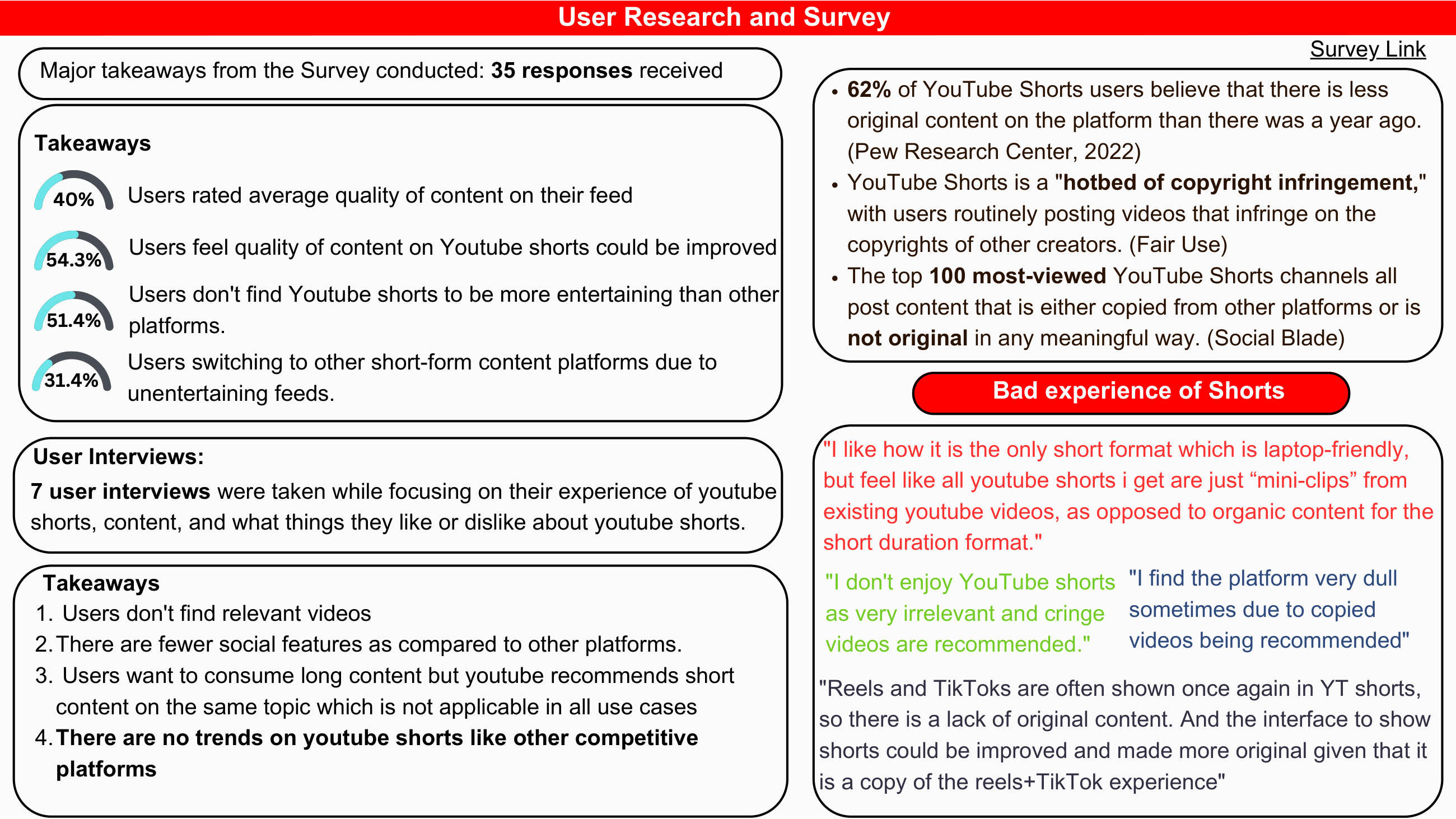
Survey results from 35 responses. 54.3% felt quality could be improved; 31.4% had already switched to competitor platforms. User quotes on the right confirmed the content supply problem, not a UI problem.
The patterns
Three themes kept showing up — and they weren't what I'd expected:
- Recycled content. Users were seeing the same Reels and TikToks reposted on Shorts. Not transformative remixes — straight reposts with the watermarks visible.
- Stale trends. By the time a trend showed up on Shorts, it had already peaked on TikTok and Instagram. Users felt they were watching the lag.
- UI familiarity, not problem. Several users specifically noted that the interface was fine — they just wanted different content in it.
It's a supply problem dressed as a product problem.
"Reels and TikToks are often reshown in Shorts, so there is a lack of original content. The interface could be improved — but honestly, it feels like a direct copy of the reels experience." P3 · interview · 24F · Mumbai
The temptation when you get a brief like "improve feed quality" is to redesign the interface. New gestures. New badges. New thumbnails. That would have been the wrong answer.
The actual problem was on the supply side: creators weren't building Shorts-native content. They were repurposing what already worked on TikTok and Reels. Which meant Shorts kept feeling like a discount version of platforms users had already left.
If the supply problem was the real problem, then the solution had to do two things: surface the small amount of original, YouTube-native content that did exist, and create a structural incentive for creators to make more of it.
Three solutions on the table. One worth shipping.
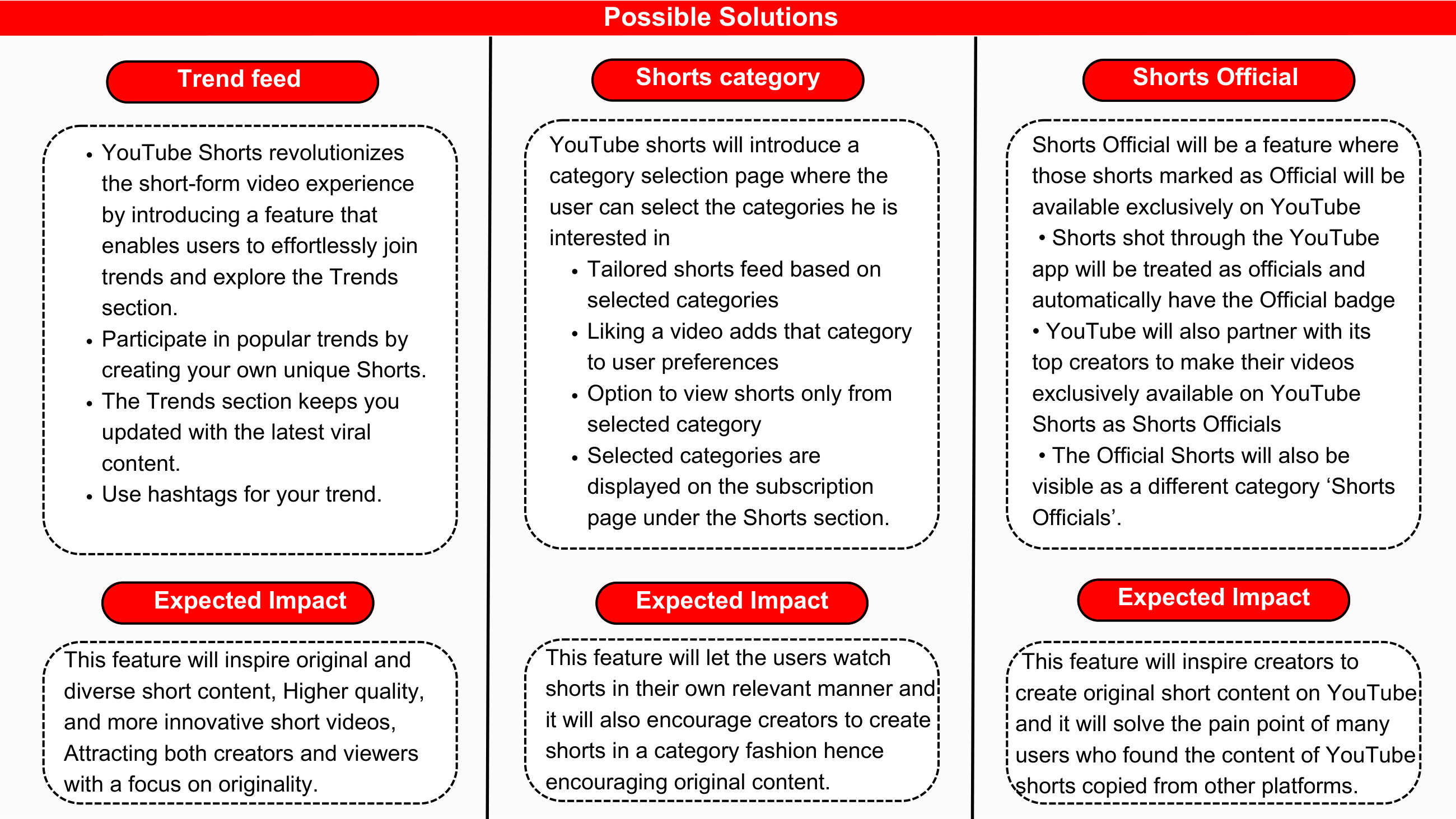
Three candidate solutions evaluated on RICE. Trend Feed scored 20 (highest reach, high confidence, manageable effort). Shorts Official at 16. Shorts Category at 9 — useful but solves the demand side, not the supply problem.
I evaluated three candidate solutions using a simple RICE-style framework — Reach × Impact × Confidence ÷ Effort. Not because RICE is the only way to think, but because it forced me to be explicit about why one solution beat the others.
- Trend Feed — a dedicated section surfacing trending, YouTube-native Shorts with a clear "Trending" badge and a hashtag-driven trend page. RICE score: 20.
- "Shorts Official" badge — a quality signal on shorts that originated as native YouTube content. Useful, but not transformative. RICE score: 16.
- Category selection at onboarding — let users pick interest categories. Already partially solved by the recommender; nudges the algo but doesn't fix supply. RICE score: 9.
Why Trend Feed won
It addresses both sides of the problem. On the user side, it gives them a high-quality, native-content section they can opt into. On the creator side, the visible "Trending" badge and "Join this trend" button creates a structural incentive — make a Shorts-native take on a trending topic, get distribution. Highest reach (every user), highest confidence, manageable effort.
A section, a badge, and a button.
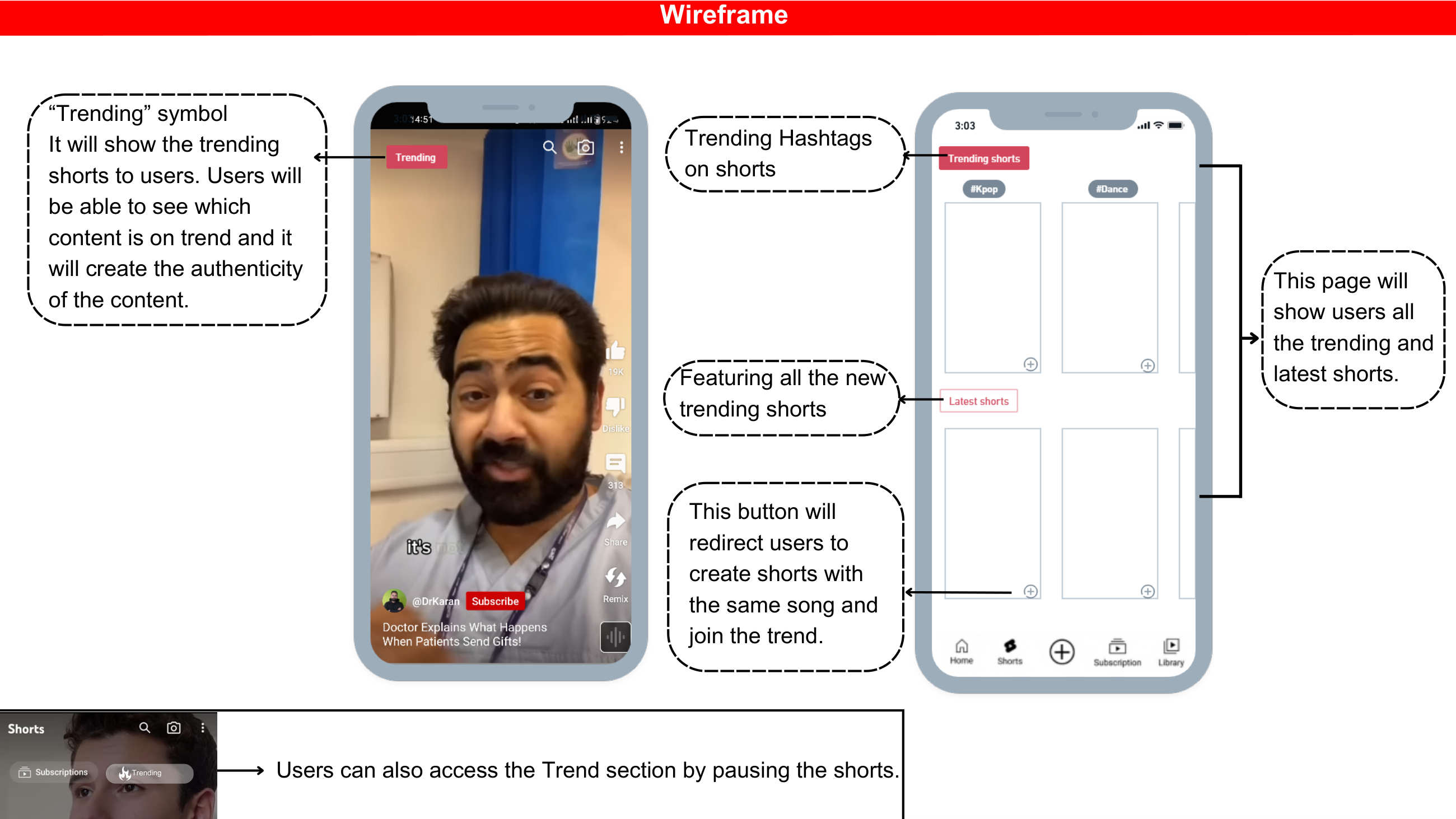
Left: a "Trending" badge surfaced on native YouTube Shorts. Right: the dedicated trending page with hashtag categories (#Kpop, #Dance) and a Latest Shorts section — giving users a clear destination for original content.
For viewers
- A new "Trends" entry point on the Shorts home — surfaces YouTube-native content tagged to active trends.
- A "Trending" badge on individual Shorts when the audio or theme is currently rising on YouTube.
- Hashtag-based trend pages where users can scroll all takes on a given trend in one place.
- A mid-scroll entry: pause a Short, and a small "see all trending takes" button appears.
For creators
- A "Join this trend" CTA on any trending Short — opens the camera with the same audio/template pre-loaded.
- Creator-side analytics showing which trends they participated in, and how much distribution they earned from each.
What it deliberately doesn't do
It doesn't try to compete with TikTok on raw trend speed. YouTube will always be a step behind on that. Instead, it tries to compete on depth — longer, more produced takes on trends, leveraging YouTube's creator base that's already comfortable shooting at higher production value.
North star, with backup.
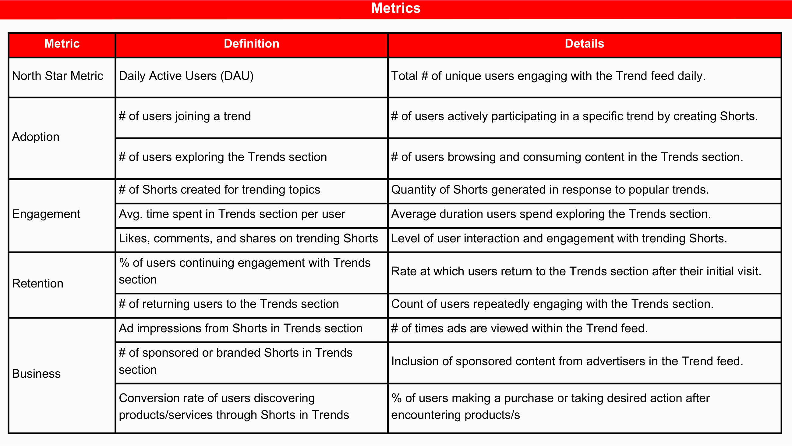
The full metrics framework across five categories. North star: Daily Active Users engaging with Trend Feed. Business metrics include ad impressions and conversion rate from Trend content — the numbers that justify the feature to YouTube leadership.
North star metric
Daily Active Users engaging with the Trend Feed. Engagement here means: scrolled at least one Trend Feed Short to ≥75% completion, or tapped into a trend hashtag page.
Supporting metrics
- Creator-side supply: number of Shorts created against trending topics per week. This is the real leading indicator — if creators show up, the feed self-heals.
- Average time in Trend section per user: tells us whether the section is a destination or a curiosity.
- Cross-cohort retention: does engaging with Trends correlate with returning to Shorts the next day?
- Counter-metric: overall time spent in Shorts shouldn't drop. If Trends cannibalises rather than expands engagement, the feature failed.
What I'd do differently — and what I'd do again.
The lesson here wasn't the solution. The lesson was the framing.
- I'd do the user research again. The "it's the content, not the UI" insight only emerged because I asked open-ended questions. A survey alone would have given me directional unhappiness without diagnostic clarity.
- I'd push back on the brief earlier. "Improve feed quality" was the wrong question. The right question was "why is feed quality declining?" — and reframing the brief saved me from solving the easy, visible problem instead of the harder, hidden one.
- I'd want to validate with creators in production. The supply-side hypothesis is only as strong as creators' willingness to act on the incentive. The feature's success is downstream of creator behaviour, not user behaviour.
The case was selected as part of my NextLeap fellowship portfolio (top 4% of 500+ applicants). More importantly, it became the way I think about every product brief I get now: am I being asked the question I should be answering?