Redesigning the LMS students were already complaining about.
A scholarship case for the Masters' Union PM Bootcamp. The brief: redesign the learning portal for the next cohort. The catch: the existing one wasn't broken so much as scattered. Five tools doing the work of one. Here's how I'd consolidate it — and how it won me ₹2.45L in tuition.
"Redesign the LMS for the incoming PM Bootcamp cohort."
That was the prompt for the Masters' Union PM Bootcamp scholarship case. A real product brief — the LMS would actually be in use, and the team had visibility into student complaints from prior cohorts.
The deliverable: a complete UX redesign — personas, prioritisation, wireframes for both student and professor flows, and a defended set of design decisions. The case had a hard 72-hour turnaround.
The portal wasn't broken. It was scattered.
The existing LMS suffered from a problem I'd seen elsewhere — it had grown organically, with each new feature added as a separate surface. Five different things students had to track, none of them in the same place:
- Zoom links came in via email, often shared late, sometimes lost in inbox noise.
- Assignments lived in the LMS but lacked a unified view across courses.
- Schedules were tracked separately — students were maintaining their own calendars.
- Grades and feedback were posted asynchronously, sometimes via comments, sometimes via separate documents.
- Mentor booking happened over WhatsApp groups — convenient, but unreliable.
The problem wasn't any individual feature. It was that students had to remember which surface held which information at any given moment. Cognitive load was the real bug.
On the professor side, the audit found a parallel issue: no centralised view of student submissions across courses. A professor teaching two cohorts had to click through two separate course portals to grade.
Same portal, opposite needs.
The trap with an LMS is assuming students and staff want the same thing, just from different angles. They don't. Students are time-poor and want compression; professors are workload-driven and want batching. The portal had to serve both.
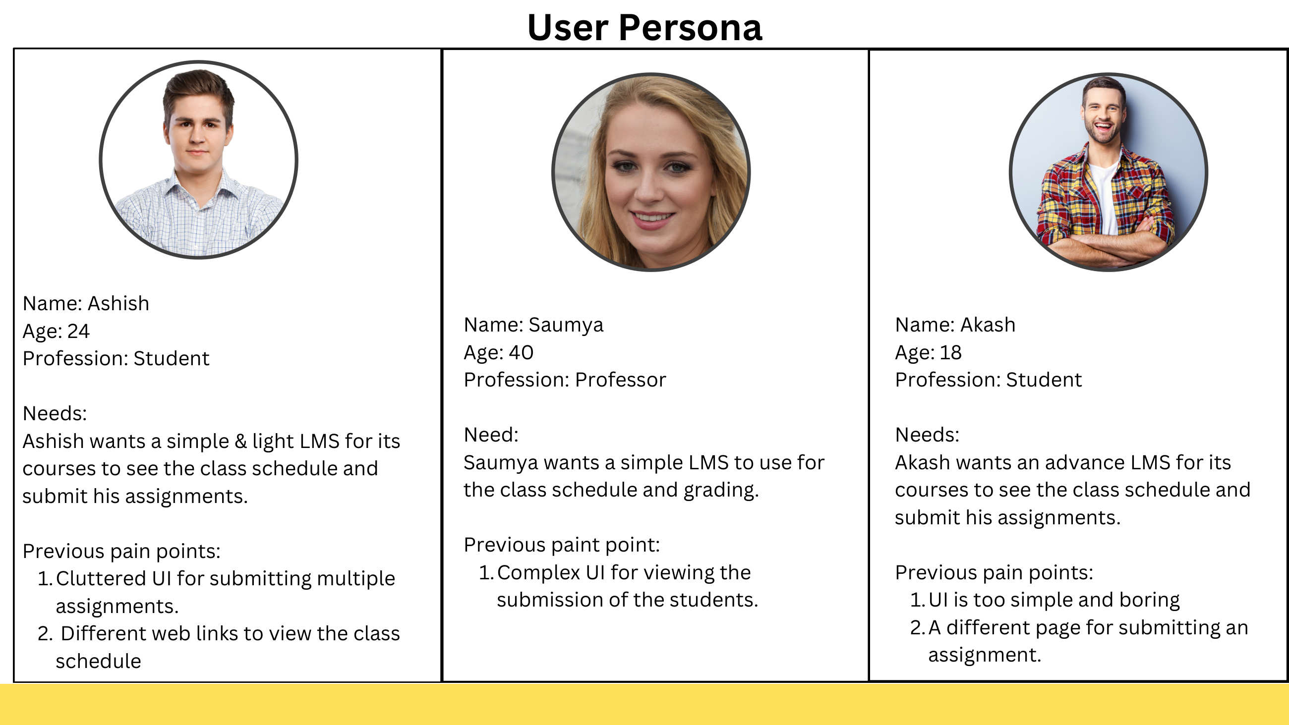
Three personas. Two students with opposite preferences, one professor. The divergence between Ashish and Akash is why a single "student dashboard" would have been wrong — even the user base wasn't uniform.
Ashish · 24 · Student
Wants a single source of truth: what's due, when's class, where's the Zoom link. Pain: cluttered UI for multiple assignments, no unified schedule view, anxiety about missing deadlines.
Saumya · 40 · Professor
Wants a simple grading interface and a clear view of student progress. Pain: complex UI for viewing student submissions across courses; spends evenings batch-grading.
The implication
Two separate login flows, two distinct dashboards. Trying to serve both with one shared view would over-complicate both. This wasn't role-based UI on a shared screen — it was two products under one brand.
Prioritising under a 72-hour clock.
I ranked the candidate features by impact and frequency of use — assuming this was an MVP launch, what had to be in v1 vs. v2:
- Calendar — High. Essential. Zoom links + class times in one place. This is the feature students will touch every single day.
- Assignment submission — High. Core assessment workflow. Has to be unified across courses to remove the cognitive load.
- Portfolio — Medium. Useful for periodic feedback and external sharing. Not a daily-use surface, but high signal when used.
- Mentorship sessions — Medium. Important, but workaround exists (WhatsApp). Worth building, but not before calendar and assignments.
- Feedback section — Low. Nice to have. Can ship in v2 once the core flow is stable.
The principle: fix the daily-pain features first. The portal succeeds if students stop maintaining their own external calendar and assignment tracker. Everything else is downstream of that.
One portal. Two dashboards. Five fewer tools.
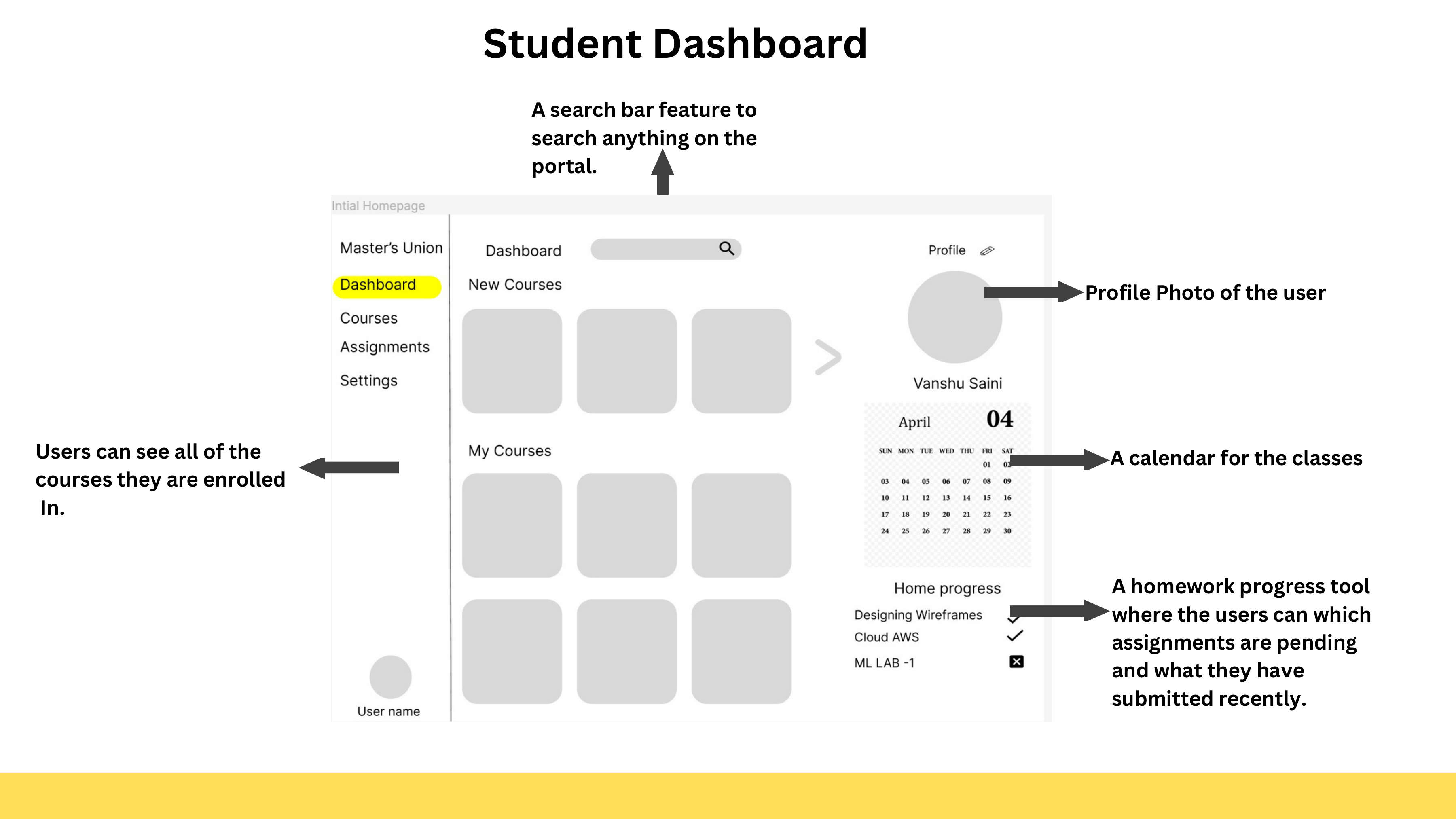
Student dashboard wireframe. Left nav gives one-click access to all sections. Center shows enrolled courses. Right sidebar has a calendar and a homework progress tracker — the two things students check every time they open the portal.
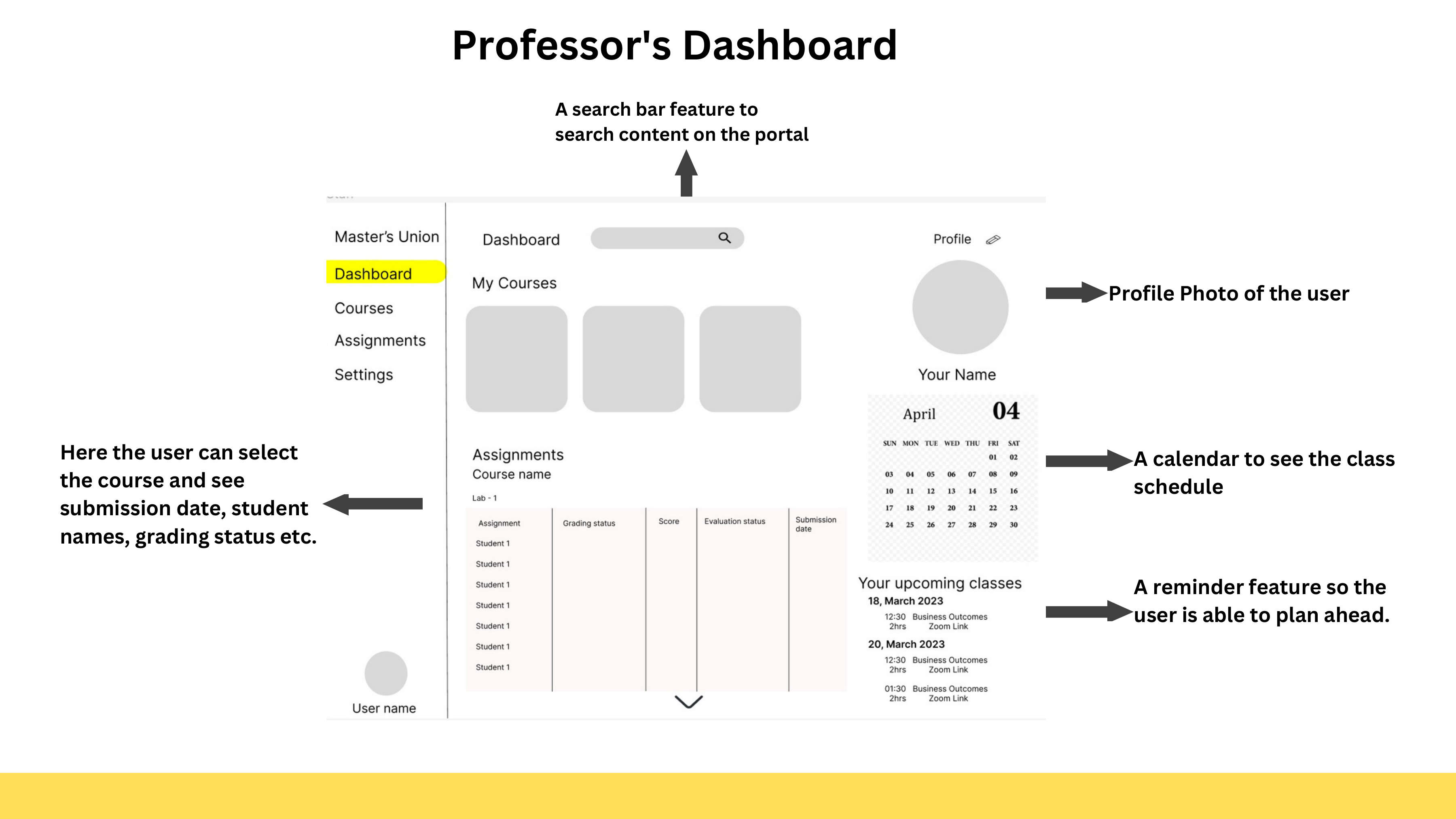
Professor dashboard wireframe. Assignment submissions from all courses in one view — no clicking through separate course portals. Upcoming classes with direct Zoom links in the right sidebar.
Student dashboard
- Left nav — Home, Courses, Assignments, Portfolio, Mentors.
- Centre — Today's view: live class card (with Zoom link), assignments due in the next 7 days, mentor session reminders.
- Right sidebar — Upcoming classes (next 5), with one-click Zoom join. The most accessed function gets the most accessible real estate.
- To-do section — Below the fold, persistent, with deadline visibility. Anxiety-reducing by design.
Professor dashboard
- Left nav — Home, My Courses, Grading Queue, Students, Resources.
- Centre — Grading queue across all courses, not just one. Filter by course, due date, or student. Inline grading with rubric on the right.
- Right sidebar — Upcoming sessions across courses, with Zoom join + class roster preview.
Shared infrastructure
Single auth, role-based dashboards. The login screen branches into the right experience after authentication. Same brand, same design tokens, different defaults.
The small calls that shape the experience.
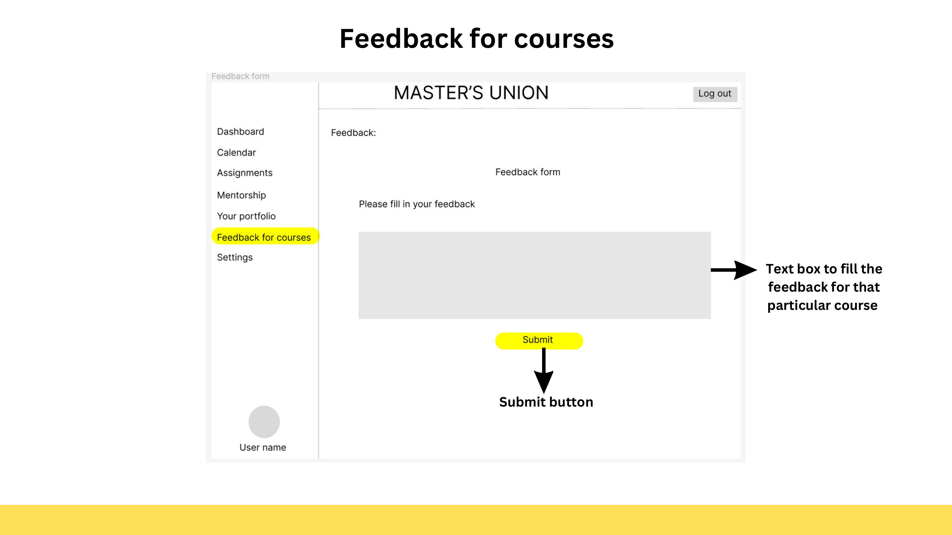
The final redesigned student dashboard. Left nav covers everything: Dashboard, Calendar, Assignments, Mentorship, Portfolio, Feedback, Settings. Centre shows courses and a pending feedback alert. Right sidebar shows upcoming classes with Zoom links — the most-used action in the most predictable location.
Three decisions I'd defend in any room:
- Two separate login flows. Tempting to do one shared login with role detection. Wrong call. Permissions differ, mental models differ, even the language is different (a student has "assignments due," a professor has "submissions to review"). Splitting at the door means the next 100 clicks don't have to compensate.
- Right sidebar for class joins. The single most-used function — joining the next class — gets the most predictable location. Not buried in a calendar tab. Not a notification. Sitting there, every time the portal opens, waiting to be clicked.
- Visible deadline ladder. The to-do section sorts strictly by deadline with explicit time-remaining ("in 2 days," "in 6 hours"). Students don't miss deadlines because they don't care. They miss them because they lose track. Surface the time, win the trust.
1st Runner Up. 50% off tuition.
The case was selected as a 1st Runner Up at the Masters' Union PM Bootcamp scholarship round. The award: 50% scholarship — ₹2,45,000 in tuition discount.
More important than the prize: the case taught me how to defend design decisions out loud. The judging panel asked the questions you'd expect — why two login flows? why not a single dashboard? why is mentorship medium-priority? Being able to answer those questions with explicit reasoning, not aesthetic preference, was the actual product of the exercise.
What I'd revisit
Two things I'd push further with more time:
- Mobile-first audit. Students live on phones. The wireframes I shipped were desktop-first; the next iteration would invert that and treat the desktop view as the wider variant.
- Notifications design. "When does the portal interrupt you?" is its own product question. I scoped it out of v1; in production I'd treat it as central.
The portal redesign was a case. The lesson — defend the call, don't just make it — has shown up in every PM conversation since.